August 2021 – May 2022
These highly-connected hub trees, also known as Mother Trees, share their excess carbon and nitrogen through the mycorrhizal network with the understory seedlings, which can increase seedling survival. These Mother Trees in this way act as central hubs, communicating with the young seedlings around them. In a single forest, a Mother Tree can be connected to hundreds of other trees.
The Mother Tree Project
MyCorr helps us better reach out to our support networks. My undergraduate capstone project, this app design responds to problems faced by international interviewees when they seek support from mentors, family, and friends. It provides a traffic signal for social support availability–how available you are to support others in your network–and offers integrations to quickly contact someone using apps we already know and love.
In the Beginning
During 2020, amidst the coronavirus pandemic, George Floyd Protests, Stop Asian Hate, and the other public-consciousness-shifting events, I started to notice the word ‘Ally’ all around me. Moving back-and-forth between Hawaii and New York, I found myself frequently in video calls with other white people asking me to define ‘Allyship’ for them, or to tell them how to be a ‘better Ally.’
From the start, I knew these were bad questions, so I did my best to re-frame the conversation in terms of how each person could engage with our sociopolitical situation. Very quickly, I found myself accidentally conducting the informal interviews I learned from Prof. Niobe Way, asking people about the ways they construct and experience empathy, activism, and identity in their lives.
In the fall of 2021, this capstone gave me a chance to start a project from scratch. Faced with the terrifying scenario of no parameters, I imposed my own. The project would not be about me. It would emerge in response to a problem faced by others, and it would be developed with their input.
Concept Discovery Interviews
To kick it off, I formalized those conversations-turned-interviews around ‘Allyship,’ with the hope of finding a place to intervene as a designer. I conducted sixteen semi-structured interviews with members of the NYUAD and UWC USA communities. From these interviews, I extracted meaningful quotes and arranged them into an affinity map of eight topics: empathy, harm, listening, self-care, barriers , queerness, success, and ally.


Sitting and sketching with this affinity map produced a variety of potential projects, one of which was an application that could reduce the barriers people face when reaching out.
This idea emerged from a theme of communication friction. Several people described feeling exhausted when educating others about Allyship. They would brace for being re-traumatized when trying to convince aspiring allies of systemic inequalities while already living a life threatened by those inequalities. The intellectual and emotional effort involved left some wishing others would be more considerate up front.
A similar desire appeared when people spoke of feeling guilty because they lacked the bandwidth to support their friends or family, or, on the other side, feeling crestfallen that the other person could not show up. Specific experiences often featured an intersection of the isolation of the coronavirus pandemic and the transnational relationships characteristic of these two international communities.
Understanding the Problem(s)
In the spring of 2022, I issued a preliminary survey to the NYUAD student body about their motivations and challenges when using mobile apps to reach out. This survey laid the foundation for five customer discovery interviews, and it revealed applications to focus market research on.
Customer Discovery Interviews
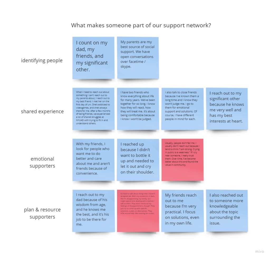
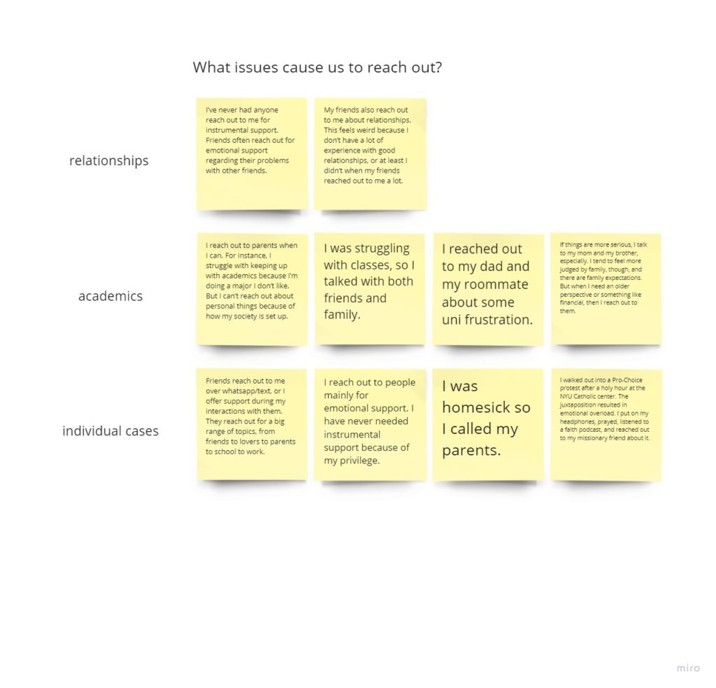
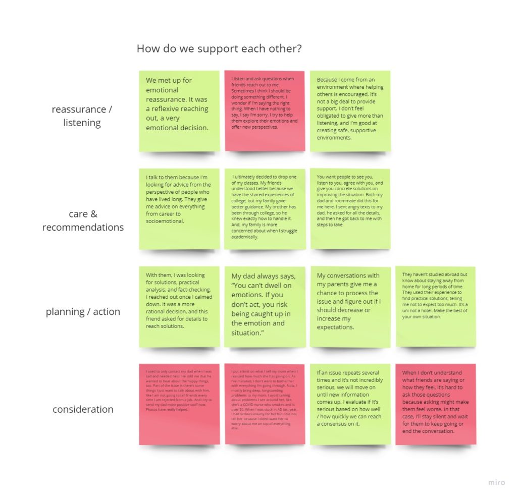
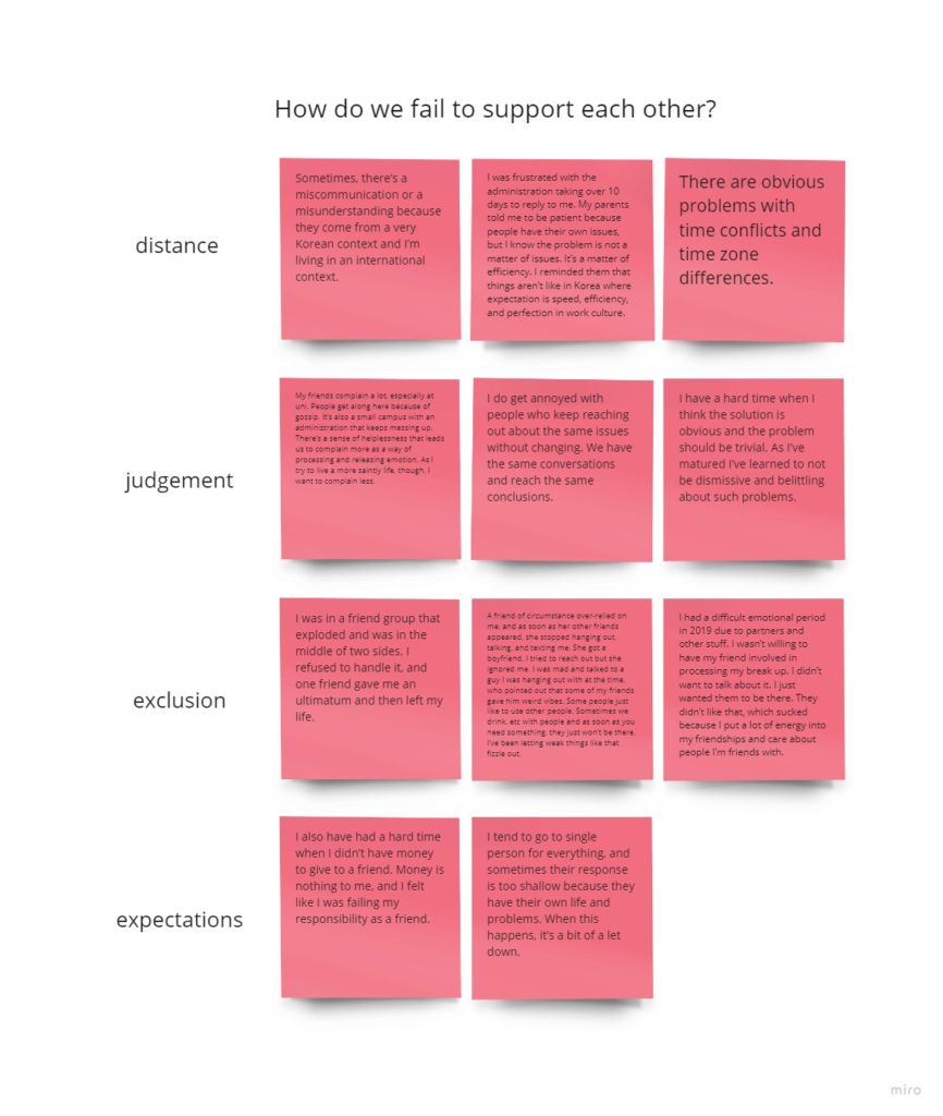
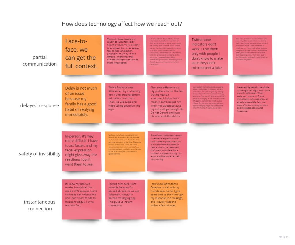
Similar to the preliminary interviews, I extracted quotes from these five interviews, and arranged them in an affinity map, this time around five key questions:
- What makes someone part of our support network?
- What issues cause us to reach out?
- How do we support each other?
- How do we fail to support each other?
- How does technology affect how we reach out?
This process helped further define the the why and how of MyCorr :
- people reach out for both socioemotional and practical support
- our support networks include those who have shared experience, make us feel safe, and can offer support we need
- we reach out about specific issues within the pillars of our lives
- digital tools cannot provide the comfort of touch, but people feel they have to call/text first before they try to meet up in-person
- delayed responses can cause additional stress for those reaching out
- expectation of instantaneous response can also cause stress for the recipient, and reduce the quality of the response
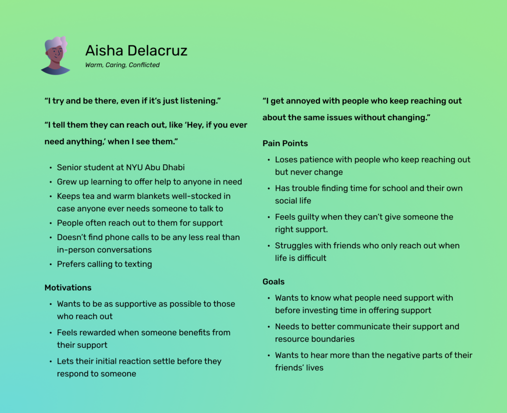
Personas
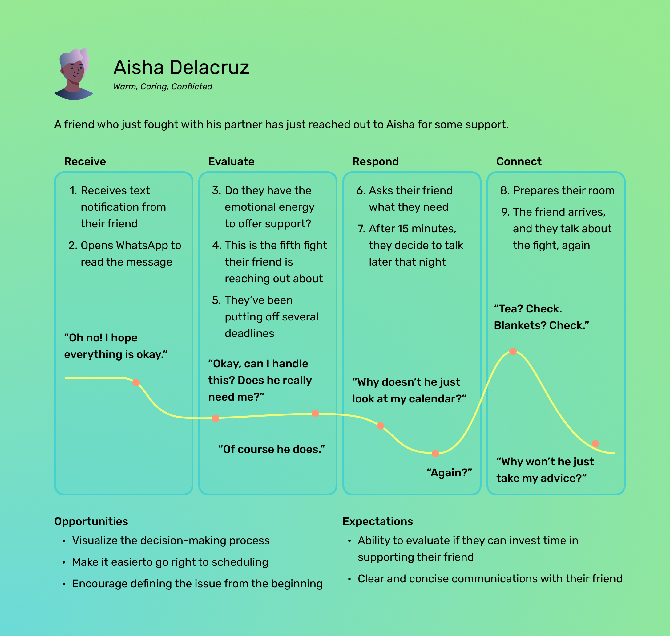
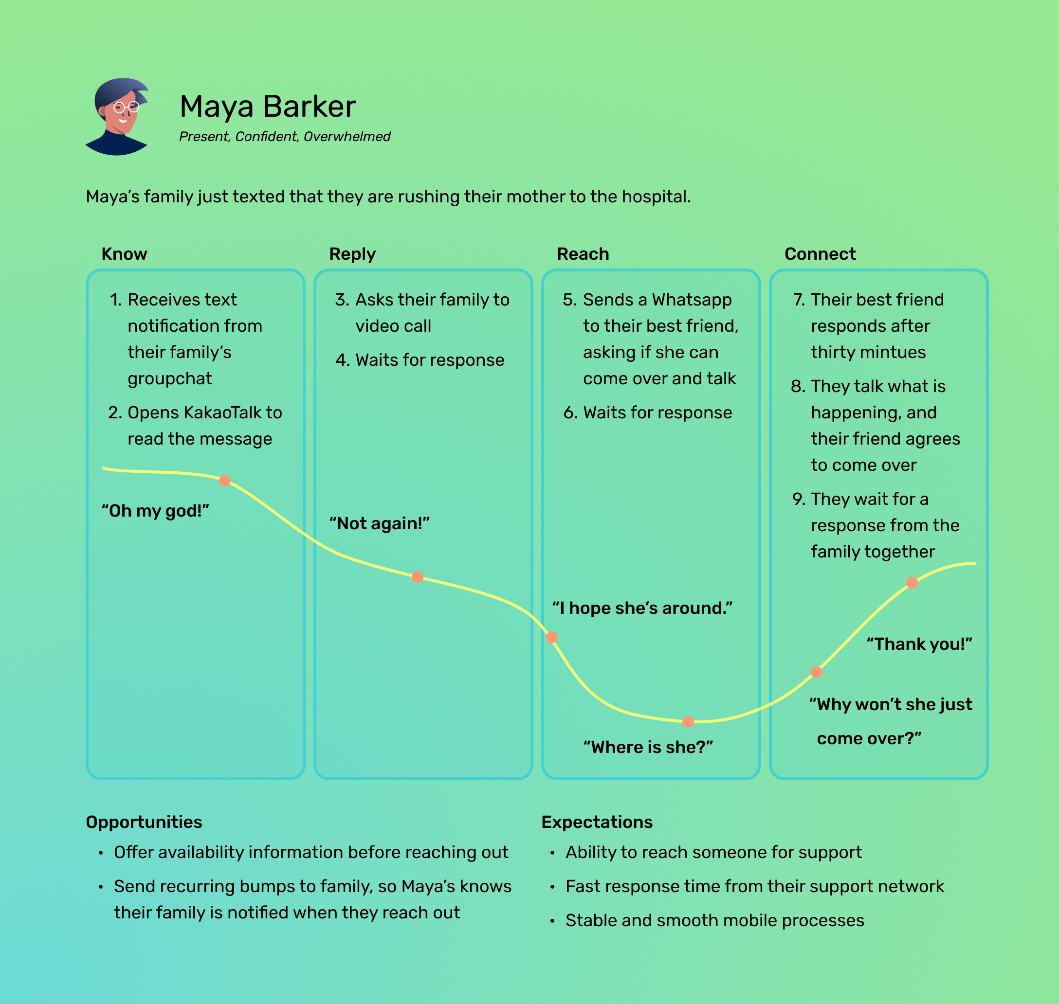
Turning these affinity maps into two personas helped me understand the people who MyCorr would serve best.

Journey Maps
Putting each persona through a hypothetical scenario showed clear opportunities for MyCorr to ease the process of reaching out.
Market Research
I also conducted a competitive analysis of existing communications and support network applications, and then I performed a heuristic evaluation on the most direct competitor.
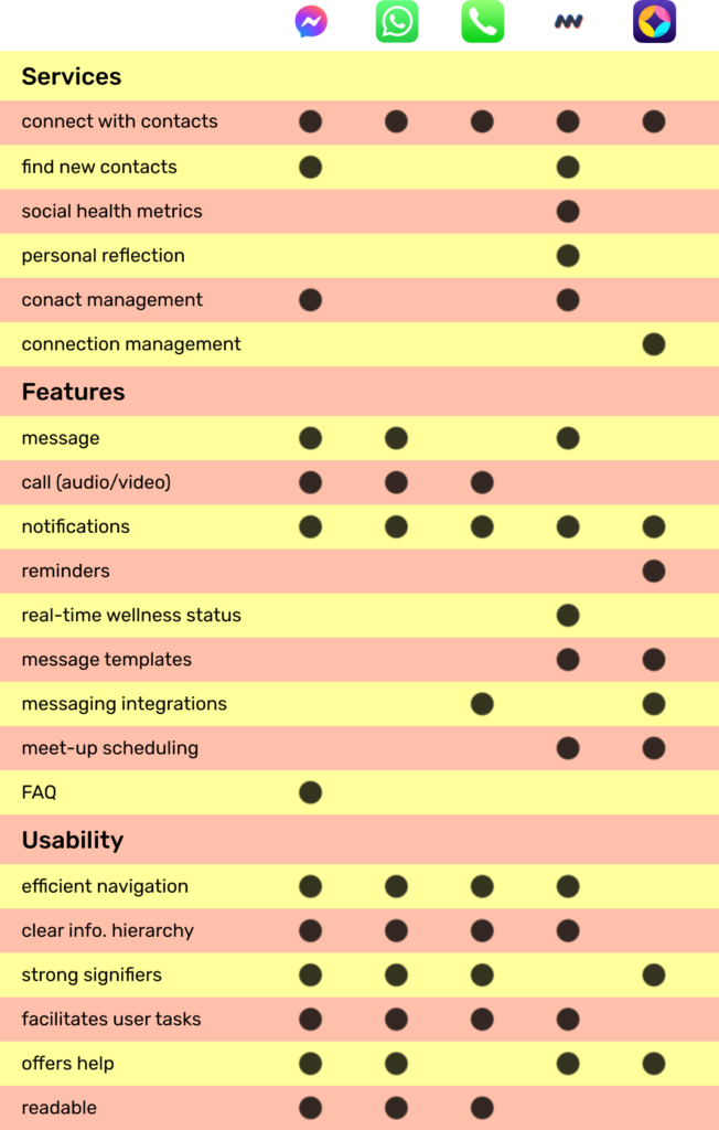
These helped me understand existing tools and identify opportunities for improvement:
- integrate with existing applications for messaging, calling, and calendaring
- allow each person access to the data they produce, organized in a useful and compelling way
- only differentiate between reaching out to one person versus a group
Hypotheses
- provide a secure, personalized space that reduces the barriers each person faces when reaching out to their social support network
- simplify decision-making, integrate with applications people already know and love
- facilitate boundary-setting to reduce miscommunications and improve disparities between support needed and support offered
Features List
A prioritized list of features guided the development iterations:
- Onboarding
- Sign-in
- Support network outreach
- reach out to people in your network with green and yellow statuses via text, call, email, and/or calendaring
- Add contacts to support network
- add contacts through a QR code on the profile page
- Quick support status update
- update your support status from Profile or Network
- Whole-network support hours
- automate your support status and contact methods
- Individualized support hours
- individualize support hours and support status for each support relationship
- Individualized notification negotiations
- negotiate push notification frequency for each person in your support network
Task Flows
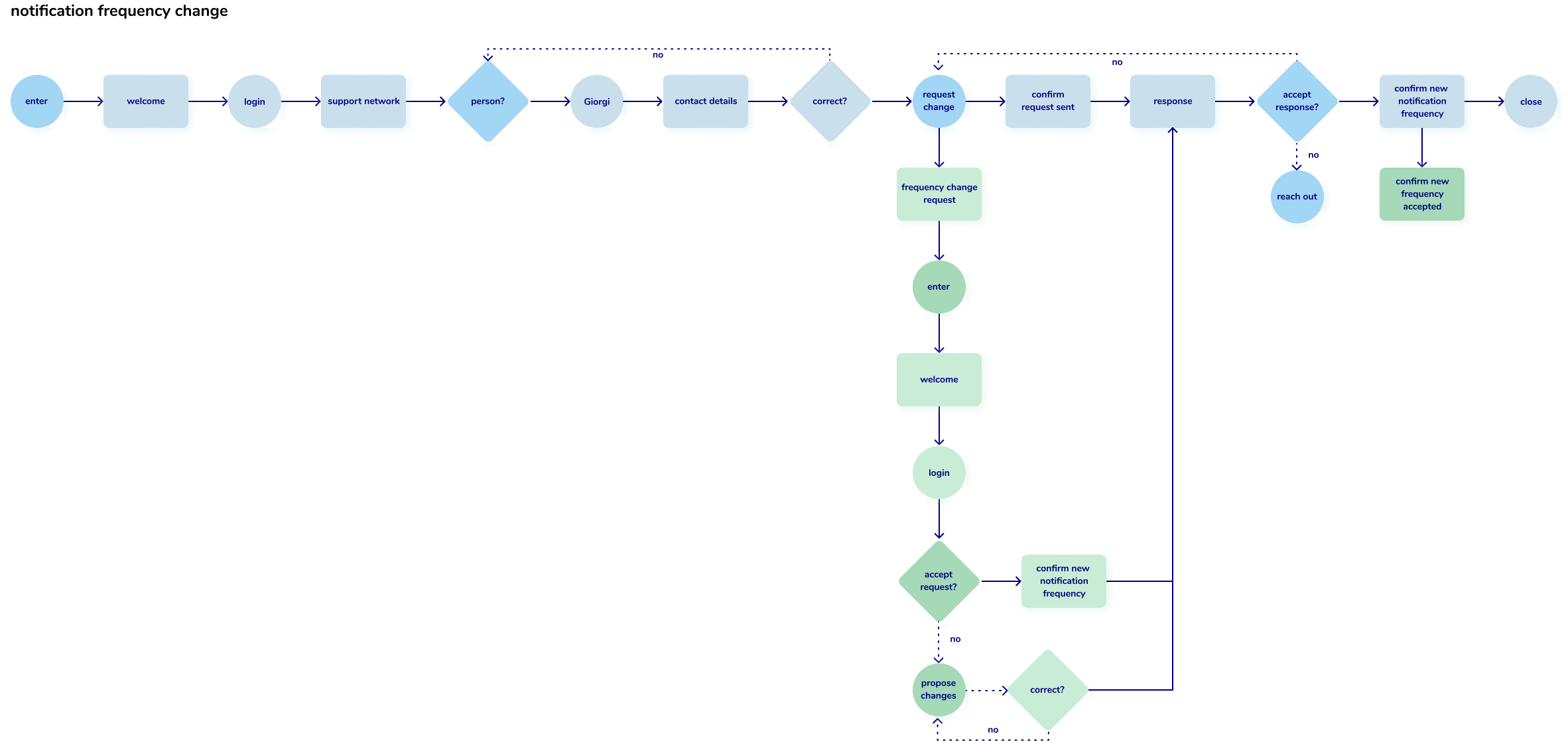
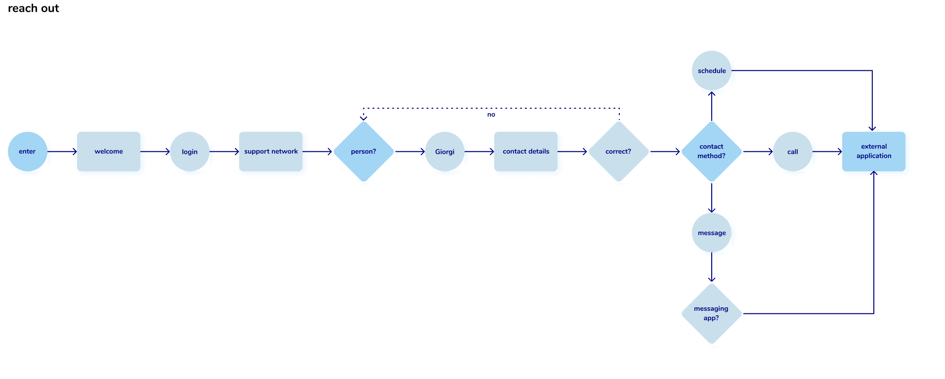
With tasks flows, I outlined the specific processes people would go through to accomplish tasks in MyCorr, including their choices and the specific screens they would encounter.




Microframes
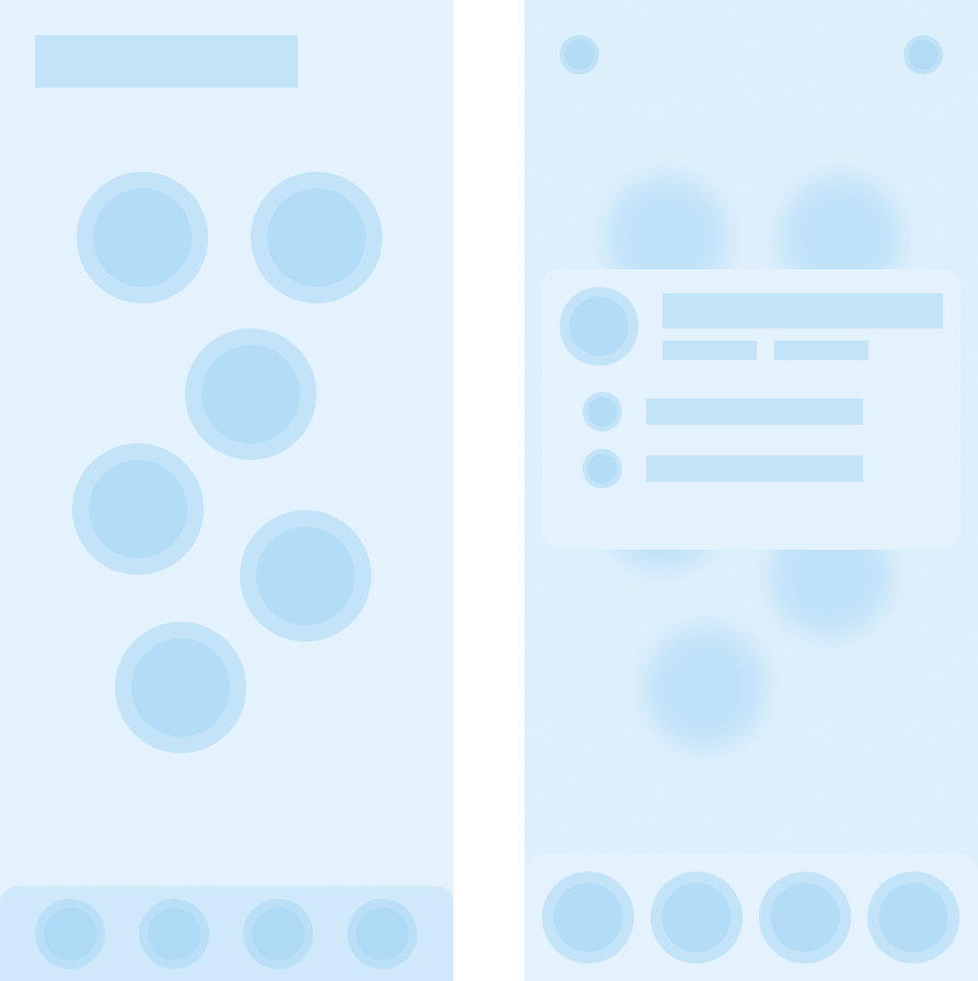
These pure-geometry wireframes helped me quickly establish layouts, information hierarchies, and navigation, as well as remove extraneous screens.
Low Fidelity Prototypes
I tested two low-fidelity prototypes with five people each. Each person completed a series of tasks and discussed interface and experience improvements.
First Prototype

Tasks
- reach out to someone in the network
- sign up and onboard to the application
- change your support status
Key Changes
- moved the prototype into ProtoPie for keyboard and camera integrations
- applied iOS design standard
- removed onboarding and focused on intuitive feature use instead
- added the support hours feature
- restructured the navigation
Second Prototype
2Tasks
- reach out to someone in your support network
- add a close friend to your support network
- show your mom your QR code to be added to her support network
- change your support status to red
- change the yellow support hours to green
Key Changes
- applied a visual identity
- increased visual redundancies for button accessibility
- full-width action buttons distinguish them from navigation
- color contrast increased to W3C standards
- simplified buttons for contacting someone
- fixed support hours input bugs
Exhibition Prototype & Presentation


Key Takeaways
* Collaborate More
The visual identity for MyCorr was created in 30 minutes and applied intuitively. Collaborating with a graphic designer would have made the visual identity stronger by allowing time to do proper design research for it, test its effectiveness, and improve it.
* Good Design is Good Planning
At every point in the process, more planning meant less waste. For instance, creating task flows before microframes allowed me to estimate the resource cost of further developing each feature. I was able to switch to developing one feature at a time, rather than microframing everything. This made the exhibition prototype feasible, and taught me to the value of planning my processes up front.
* Listening Pays Off
Testing the application with people led me to the most user-friendly design possible. It answered everything from the effectiveness of visual redundancies to the validation of the product concept as a whole. Listening was essential to every step, from identifying a problem to creating the best solution. I hope I can take this project even further, continuing to iterate and build it into a real application.
