September 2018
Collaborators | Jana Počuchová, Amina Yahia, and Sofia Espinosa
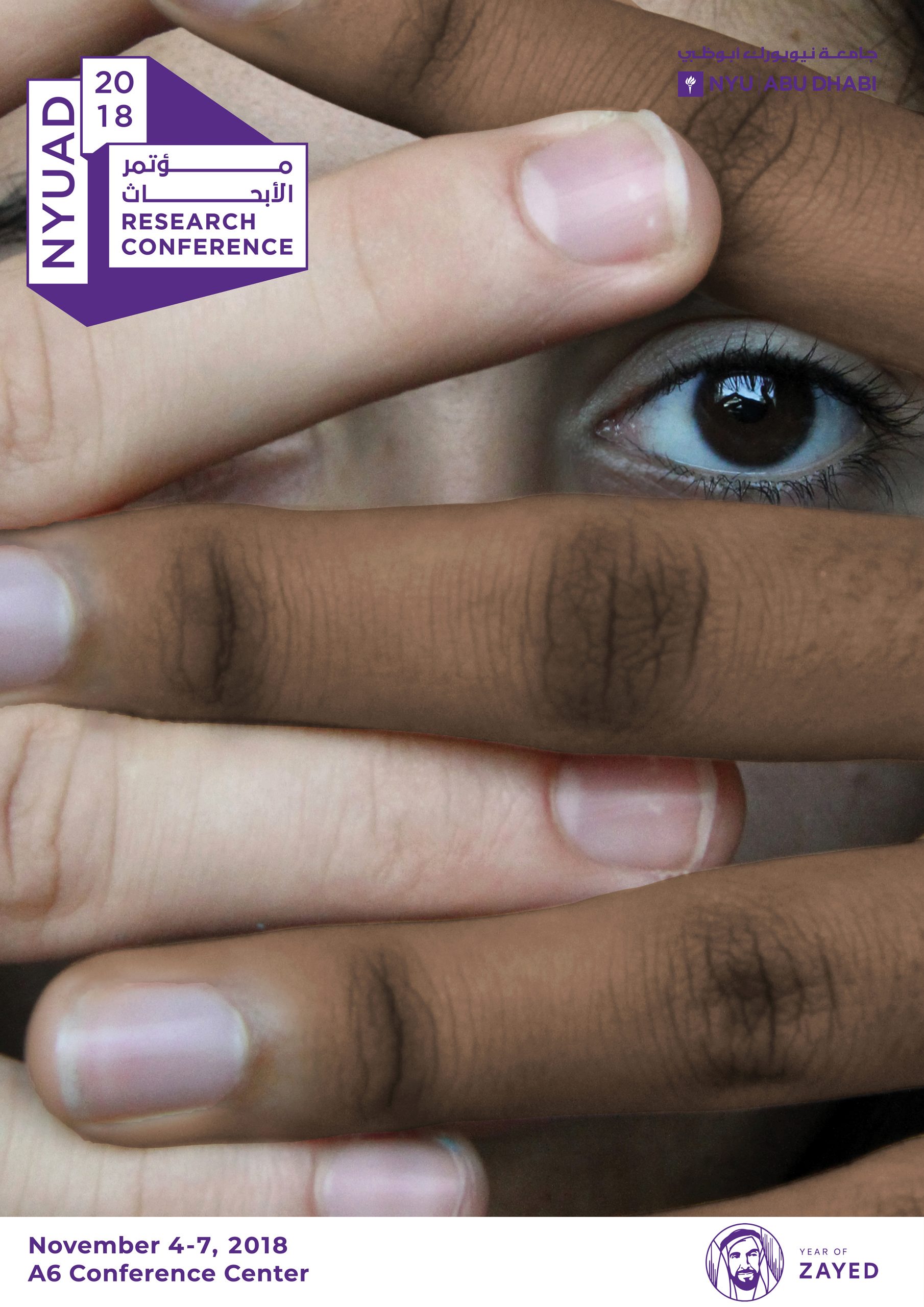
The annual NYUAD Research Conference offers opportunities for the circulation of ideas among experts and for these experts to communicate with the broader public. For this latter task, a lack of coherent brand identity and consistent visual accessibility have reared their head in past conferences. To address these weaknesses, the organizers of the 2018 conference hosted a poster competition. I worked with a small group of graphic designers to design and pitch the poster shown below.
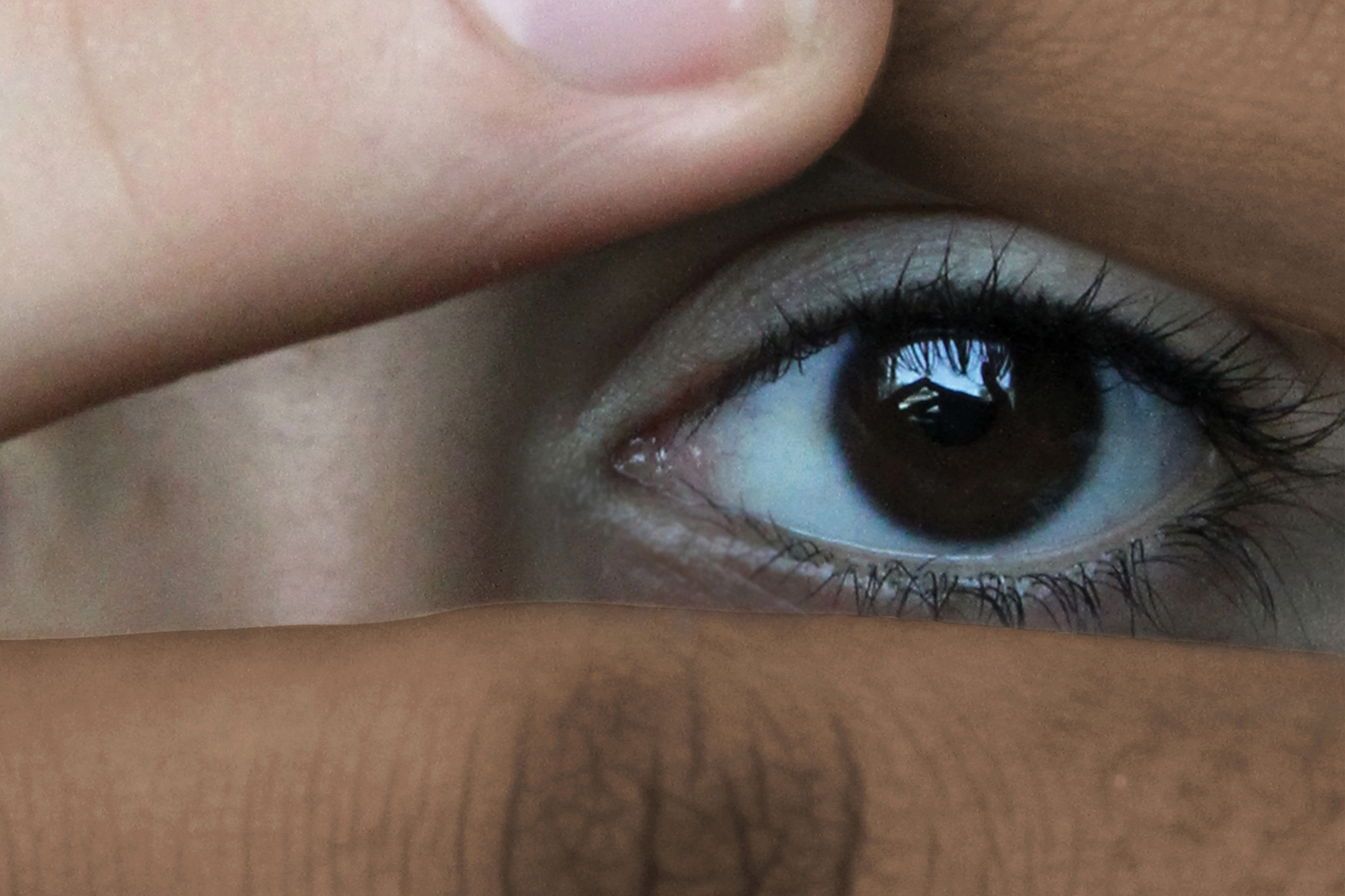
Each visual element reinforces curiosity. Hands obscure the identity of the gaze, suggesting a chance for a human connection. Encouraged by the eye peering out, this game of peek-a-boo draws viewers in and stands out among the noise of text-heavy vector graphics hung around the university. Viewers question the visuals. Who is obscuring the face, and who does the gaze belong to? The logo offers the answer−come to the conference and find out.
Contribution
This was the first time I worked on a design team for a real client. I contributed by:
- Facilitating ideation through divergent thinking exercises
- Organizing and managing the photo shoot
- Editing the working photograph

