October 2020
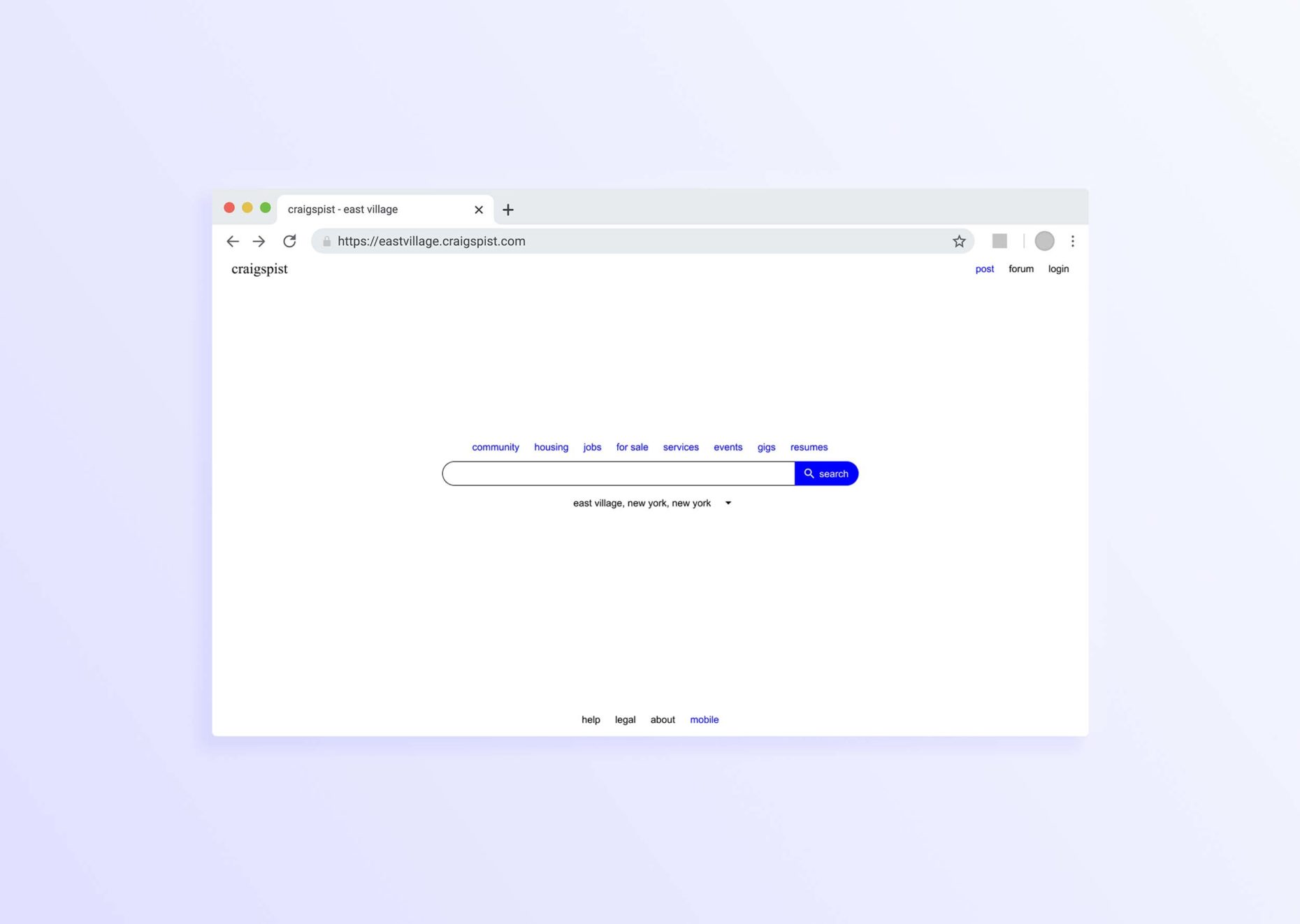
As one of my first web-design projects, I redesigned the Craigslist landing page. While Craigslist uses a bare-bones aesthetic, that same approach does not appear in the functional design of their site. The information hierarchy on their landing page is unnecessarily dense, and signifiers are inconsistent at each level of that hierarchy. With this redesign, I focused on reducing this confusion, focusing the landing page on the core search feature of craigslist and reducing both the affordances and signifiers present at each level of the information hierarchy.
My first design, shown below on the left, still contained much visual noise and a clear lack of grid. After revising and building out the final design, the repository which contained the project files was subject to a DMCA takedown on GitHub. In response, craigspist was born – a cleaner, simpler landing page for a classifieds website.


