March 2020
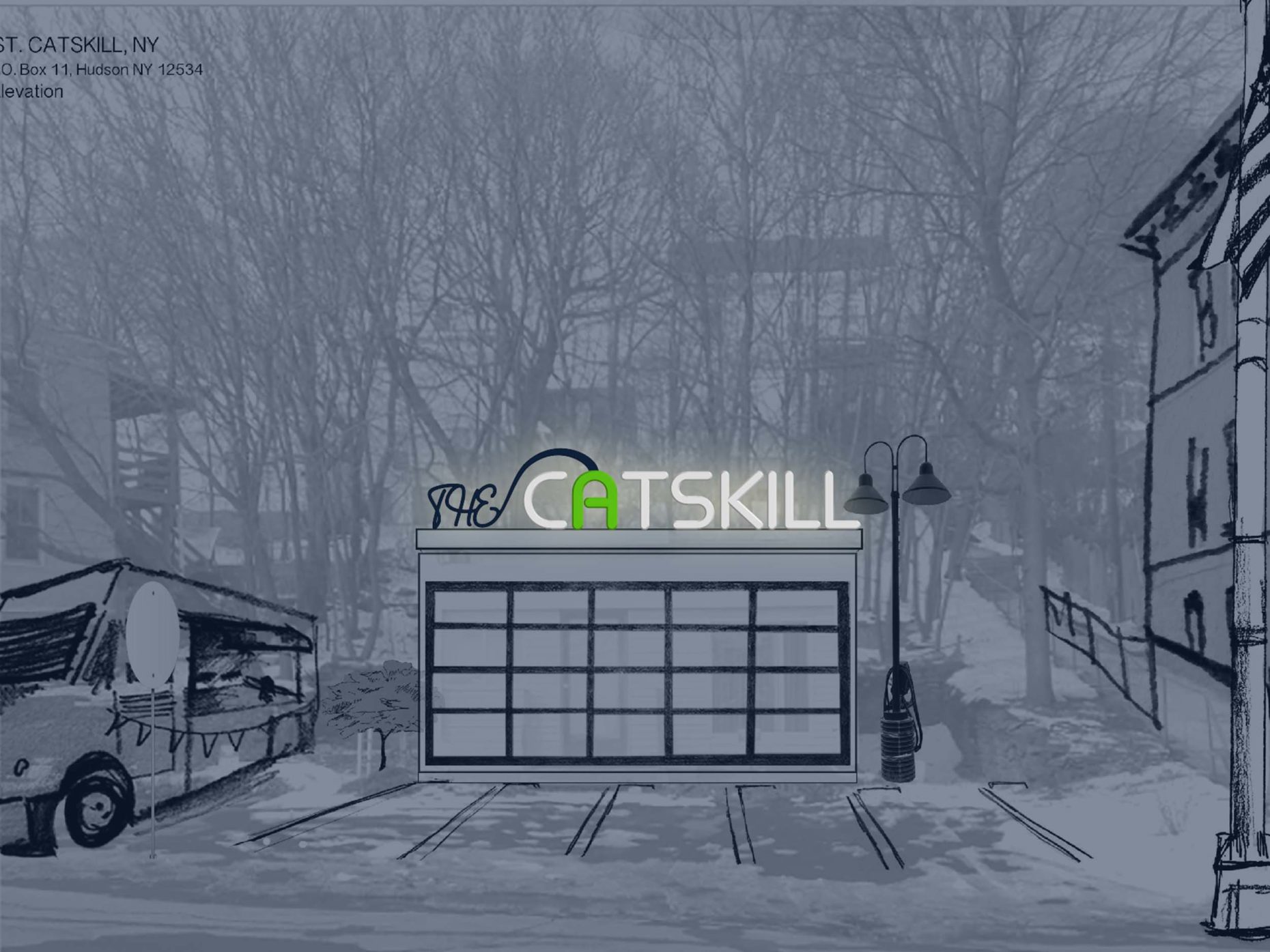
The Catskill is a planned 24-hour rest stop and electric vehicle recharge station located at 470 Main St., Catskill, New York. The property required signage to grab passing visitors’ attention and convey the unique electric services offered. The sign can be made out of found or low-cost materials. A brand color palette and logo support the signage design.


Process
One of my first and favorite design professors started a class by having us design logos for ourselves in five minutes. After looking at the result, he paused, frowned, and turned to the whiteboard. He drew a banana and then wrote “banana” underneath the drawing of the banana.
“Never do this,” he said.
We were stuck with our logos for the rest of our class, but the lesson sticks with me to this day. Too literal? Too banana. Too much hand-holding of the viewer? Too banana. Too obvious? Too banana. Don’t let your designs be too banana.
I encountered this same point later in Universal Principles of Design as the principle of proportional density. And again with Bruno Munari criticizing the wastefulness of the specificity of Euroamerican cutlery and our tendency to make things like a fruit bowl in the shape of an apple. And again, everyday, walking around and looking at storefront signs.
For the Catskill, much of the early versions of this sign were extremely banana. I wanted to pull in the metaphor of a pathway that leads into the horizon, failing to remember that such a pathway is all around every single visitor to the Catskills.


There’s no sense in blocking a view of a mountain with a logo containing the shape of a mountain. Hence, I removed the emphasis on the pathway. This let the typography speak for itself and ultimately increases the flexibility of the logo, allowing it be pulled apart and played with not only by the way I originally conceived of it.
Still, though, the logo I settled on might be too banana.